
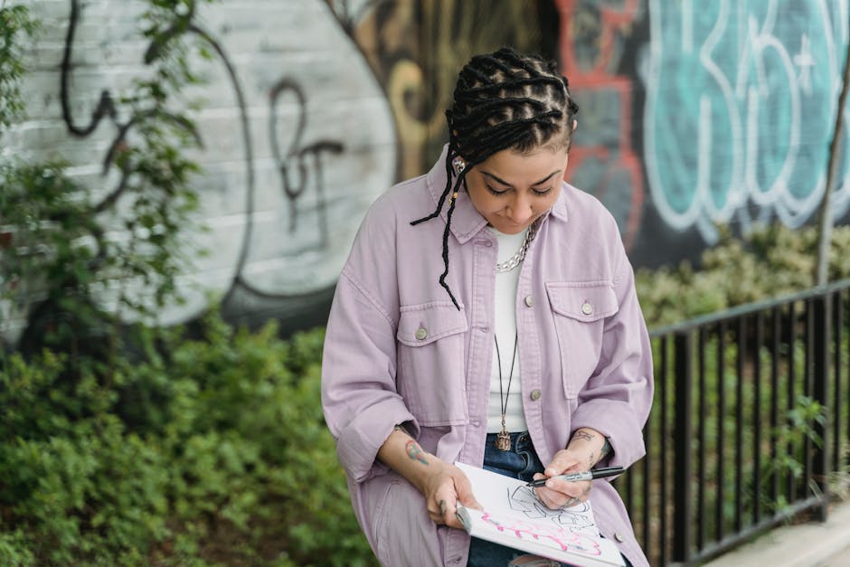
The misconception most people bring to Y2K fashion drawing is that the accessories define the era. Draw butterfly clips. Add a Von Dutch hat. Slap on a visible thong waistband. Done.
That’s not how it works. Accessories are finishes. What makes a Y2K illustration read as Y2K — or read as a bad Halloween costume sketch — is silhouette accuracy, texture specificity, and proportion logic. Those three things take actual study. The butterfly clips are the last 5% of the drawing, not the foundation.
Why Y2K Fashion Is Technically Harder to Draw Than It Looks
Every fashion era has a dominant silhouette logic. For Y2K, it’s the dropped waist combined with extreme body emphasis. The low-rise waistband sits 3–4 inches below the natural waist. The hip curve is exaggerated and present in almost every silhouette — Baby Phat built an entire brand identity on this curve. BCBG Max Azria’s bias-cut slip dresses from 2001–2004 are almost anatomically impossible in how tightly they follow the hip line.
That’s the first technical problem: you have to draw the human body first and the clothes second, with the body’s proportions being the main event rather than an afterthought beneath loose fabric.
The second problem is texture conflict. A single Y2K outfit routinely combines four distinct fabric behaviors in one look. Juicy Couture tracksuits pair velour (soft pile, diffused highlight) with ribbed jersey cuffs (structured but matte) and metallic zip hardware (hard specular reflection). Destiny’s Child’s coordinated tour looks stacked sheer mesh, holographic vinyl, and matte cotton stretch in one garment. Drawing all of those in the same illustration requires four different rendering approaches. Most beginner Y2K sketches fail here — every fabric surface ends up reading as the same generic shaded cloth.
Third issue, and the one no tutorial mentions: Y2K fashion had a specific physical attitude. Paris Hilton, Aaliyah, the entire Delia’s catalog — these were not static, mannequin-style poses. Weight was shifted. Hips were cocked. Hands went on waists or held tiny phones. A figure standing symmetrically at attention in a Rocawear tracksuit looks wrong, because no one wore these clothes that way. If your figures are stiff, the clothing reads as wrong regardless of technical accuracy.
The realistic assessment: Y2K fashion drawing is one of the more demanding era-specific niches in fashion illustration. Anyone telling you to just “add shine and low-rise” is describing the surface, not the system underneath it.
Y2K Silhouette Proportions: What Goes Where
Before any tool touches paper or screen, lock in these structural rules. Every Y2K garment category has specific placement logic that differs from other eras.
| Garment Type | Placement Rule | Key Reference | Main Drawing Error |
|---|---|---|---|
| Low-rise jeans / pants | Waistband at or below hip bone — no natural waist visibility | Juicy Couture velour tracksuit bottoms, 7 For All Mankind bootcut | Pants read as “falling down” — the hip curve must be drawn fully exposed |
| Baby tee / crop top | Hem ends 2–3 inches above the navel; close-fit through chest with zero ease | Delia’s catalog 1999–2003, Destiny’s Child coordinated sets | Top is drawn too long — anything past the navel kills the silhouette |
| Micro / mini skirt | 4–6 inches above the knee; A-line, pleated, or bandage construction | Baby Phat denim minis, early Ed Hardy graphic minis | Skirt drawn too modest in length — proportions read as 2010s, not Y2K |
| Bootcut / flare denim | Straight from hip to knee, then flares 6–10 inches at hem; always low-rise | True Religion Flare (2004), 7 For All Mankind Dojo | Flare starts too high (at thigh) instead of below the knee |
| Tube top / bandeau | Strapless, sits just below collarbone, strong horizontal emphasis | Paris Hilton’s 2003–2006 wardrobe, Von Dutch collaboration pieces | Drawn with too much vertical height — tube tops are narrow garments |
| Matching tracksuit | Zip hoodie with wide ribbed cuffs; bottoms always low-rise with side stripe | Juicy Couture, Baby Phat, Rocawear tracksuits | Forgetting the side stripe detail — plain tracksuit reads as generic sportswear |
Memorize one rule above all others: no garment in a Y2K outfit sits at the natural waist. That single anchor point determines everything else in the silhouette.
Tools That Actually Handle Y2K Textures
For analog work, Copic Sketch markers are the correct tool. For digital, Procreate with a chrome brush set wins outright. Both of those are direct picks, not suggestions to “explore your options.”
Analog Setup
Copic Sketch markers handle the layered blending that velour and PVC textures require. Alcohol-based ink lets you blend without muddying color. For a Y2K color story, you need the E series (skin tones), RV series (pinks from RV02 to RV99), BV series (cool purples and mauves), and a C-series grayscale set (C1 through C7) for metallic work. Budget around $8–$12 per marker, or buy the 72-color Copic Sketch Basic Set B for around $280.
Outlines: Sakura Micron pens in 0.3mm and 0.5mm. Do not use Staedtler Triplus Fineliners for fashion work — they bleed under alcohol marker applications and ruin any surface you try to render over them.
For texture details and highlights: Posca paint pens in white (PC-1M fine tip, about $4 each). A single stroke of white Posca over dried Copic creates the hard specular line that reads as PVC or patent leather. Also useful for zipper teeth and logo text on tracksuits.
Prismacolor Premier colored pencils (the 150-count set, around $70) layer over dried Copic to add mesh patterns and fabric grain detail. Light circular scribble for fishnet; directional strokes for velour pile direction.
Digital Setup
Procreate (iPad, one-time $12.99) with Kyle T. Webster’s fashion illustration brush pack handles every Y2K texture if you know which brushes to use. For velour: Wet Acrylic at 40–50% opacity, soft-edged, blended in two passes. For PVC: any hard round brush with a tight opacity curve, plus a white highlight layer set to Screen at 80%. The Gradient Map adjustment layer is essential for converting grayscale metallic renders into chrome effects.
Clip Studio Paint ($49.99 one-time for tablets) has better vector line tools if you intend to print or scale your illustrations. Its built-in 3D mannequin feature is genuinely useful for blocking Y2K silhouettes — pose the mannequin in a hip-shifted stance before drawing a single clothing line.
Building a Y2K Illustration from Scratch: The Sequence
- Set the fashion proportion first. Draw at 9-head height (standard fashion illustration elongation). Mark the dropped waist placement as a horizontal guide — this is the single most important line in the sketch.
- Block garment shapes as geometry. Baby tee equals a narrow rectangle. Low-rise flares equal two tapered shapes with a flare angling out below the knee. No seams, no detail — just the outline shapes sitting correctly on the figure.
- List every fabric in the outfit before coloring anything. Write them down: velour jacket, mesh insert panel, PVC belt, cotton stretch tube top. This forces you to plan your rendering order before committing color to paper or pixels.
- Render matte fabrics first, reflective surfaces last. Matte cotton or jersey goes down first because it establishes the shadow logic for the whole illustration. Metallic and glossy surfaces are drawn last because they need to reflect the established lighting environment.
- Apply shadow with a cooler, darker hue — not black. Y2K fashion used bright, saturated palettes. Shadow mixed with black reads as dirty. Shadow mixed from a darker, cooler version of the base color reads as depth.
- Add surface texture after light and shadow are resolved. Velour pile, mesh pattern, logo print — all of this goes on last. Texture applied before shading looks flat and unconvincing every time.
- Finish with accessories and hardware. Butterfly clips, chunky hoop earrings, visible logo belt buckles, platform shoe outlines. Keep these graphic and slightly sharp in contrast to the softer fabric rendering — that contrast is what makes accessories read as accessories rather than more fabric.
Rendering Velour, PVC, and Mesh: The Direct Answers
How do you draw velour without it looking like regular jersey?
Velour has directional pile that scatters light rather than reflecting it cleanly. The highlight on velour is wide, soft, and has no hard edge — the opposite of denim or woven fabric. In Procreate, use Soft Airbrush at 35–45% opacity for the highlight area, covering roughly 30–40% of the garment surface with a gentle glow. In Copic, blend the lightest value with the colorless blender (0) before the alcohol fully dries. The result should read as luminous but never sharp. If your velour highlight has a clear edge, it’s wrong.
How do you render holographic or metallic PVC?
PVC has a hard specular highlight — a single narrow strip of near-white light, roughly 8–15% of the garment’s total width. Everything else is mid-tone with reflected color from the skin or surrounding fabric. For Copic analog work: lay down B000 or BV000 as the base, let it dry fully, then draw one sharp line of white Posca across the lightest face of the garment. That one line does most of the work. For Procreate: use three layers — base color fill, a narrow white highlight strip set to Add mode at 60–70% opacity, and a subtle pink or warm tone reflected from the skin layer set to Overlay at 20%. The pink reflection layer is what separates a convincing chrome render from a flat gray one.
How do you draw fishnet or mesh efficiently?
Do not draw individual holes. The eye reads texture from pattern suggestion, not literal completeness. In Procreate: find or create a small fishnet texture tile, place it on a Multiply layer at 25–40% opacity over the skin or undergarment layer. The transparency does the work. In analog: lay down a skin-tone Copic base, apply a light circular scribble motion with a fine-line pen over the mesh area, then outline the garment edge clearly. The clean perimeter line tells the viewer’s brain how to read the interior texture — without it, the scribble just reads as noise.
The Y2K Color Palette in Practice
Four colors run the era: bubblegum pink, ice blue, pure white, and chrome silver. Pull from Juicy Couture’s 2003–2006 ad campaigns for reference — those images are essentially the Y2K color brief in executed form.
The practical Copic picks: RV06 (Cerise) and RV02 (Sugared Almond Pink) for the pink range. B000 and B01 for ice blue. W0 or C0 for whites. BG0000 for cool highlights on metallics.
The consistent mistake: too many colors in one illustration. Real Y2K outfits were monochromatic or two-tone with metallic accent. A Juicy Couture tracksuit is one color with chrome zip hardware. Overloading the palette signals costume sketch, not era-authentic fashion illustration. Edit color the same way you’d edit a sentence — cut anything that isn’t doing clear work.
Six Mistakes That Break the Y2K Read Immediately
- Natural waist placement on bottoms. If your pants or skirt sits at the natural waist, you’ve drawn a different decade. This is the single most common error in Y2K illustration and the most obvious to anyone who knows the era.
- Crop tops that end at hip level. Y2K crop tops end above the navel. Anything lower reads as contemporary streetwear or 1990s grunge, not Y2K.
- Muted or desaturated color choices. Dusty rose, sage green, warm greige — these are 2018–2026 color logic. Y2K colors are slightly too bright. If the palette feels tasteful and restrained, it’s wrong for this era.
- Wrong shoe silhouettes. Y2K footwear means Steve Madden Slinky platforms, Buffalo London chunky trainers, kitten mule slides, or strappy block-heel sandals. Clean minimalist sneakers belong to a different era. Pointed-toe pumps belong to mid-2000s corporate fashion, not Y2K.
- No logo reference anywhere. Y2K fashion was aggressively branded — Juicy Couture script across the waistband, Baby Phat cat logo on the belt buckle, Von Dutch script on the hat. Even a stylized suggestion of logo placement anchors the illustration in the correct era. A completely clean, unbranded tracksuit reads as generic sportswear.
- Symmetrical, stiff figure posing. The clothing from this era was worn with attitude — hip shifted, weight on one leg, hands placed deliberately. A figure standing at equal attention in low-rise flares looks wrong because the clothes were designed for movement and display, not neutral presentation.

