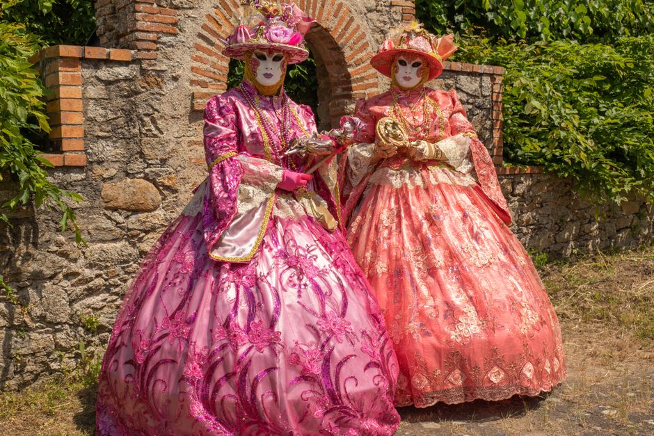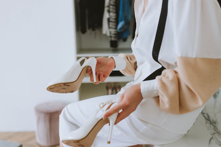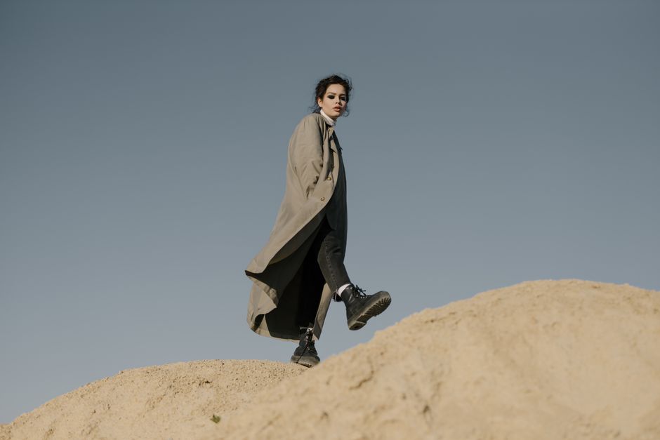
The best spring color strategy is contrast with control. Use one soft pastel or bright shade as the main color, then anchor it with a neutral, a darker tone, or a second color with similar intensity. The 2026 spring palette moves in two directions at once: airy shades such as powder blue, blush pink, butter yellow, and clean white sit beside tomato red, acid green, vivid purple, and saturated blue.
Why Spring 2026 Has Both Pastels and Brights
The split makes sense when you look at how color works in an outfit. Pastels have low saturation and a high amount of white. They soften a silhouette, reflect light, and make structured pieces feel less severe. Brights have stronger saturation. They create focus, sharpen simple shapes, and give familiar clothes more energy. Neither group is meant to replace the other.
Pastels create space around the face
Soft color works especially well near the face when the fabric has texture or a clear shape. A pale blue shirt can look polished with a crisp collar, while a blush knit feels warmer with ribbing or a brushed finish. If a pastel makes your skin look flat, move it away from your face. Wear it as a skirt, shoe, or bag and keep the top closer to your best neutral.
Brights need a visual anchor
A vivid shade looks intentional when another part of the outfit gives the eye somewhere to rest. White, navy, chocolate brown, charcoal, denim, and black all work. The strongest 2026 combinations are not random piles of color. They use a clear hierarchy: one dominant shade, one supporting shade, and a small accent. Pantone’s Cloud Dancer, a soft white, is useful here because it gives intense colors room to stand out without making the outfit feel harsh.
Which Spring Colors Work Best Together?
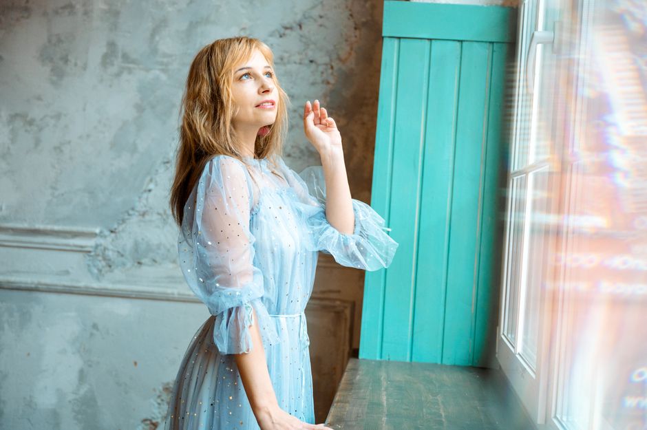
Start with the color’s intensity, not its name. Two colors can look balanced because they share a similar softness, or because one strong color is held against a quiet neutral. Use the chart below as a practical starting point, then adjust the proportion according to the setting.
Use one of these reliable color pairings
| Main color | Best partner | Easy outfit formula |
|---|---|---|
| Powder blue | Chocolate brown | Blue shirt, brown trousers, cream shoes |
| Butter yellow | Soft white | Yellow cardigan, white jeans, tan belt |
| Blush pink | Cherry red | Pink dress, red bag, neutral sandals |
| Acid green | Dark denim | Green knit, straight-leg jeans, silver jewelry |
| Vivid purple | Tomato red | Purple jacket, red top, black trousers |
Match temperature before adding contrast
Warm yellow looks natural beside red, orange, camel, and warm white. Cool blue works smoothly with lavender, cool gray, and silver. You can break this rule, but keep the shapes simple when you do. A bright red and icy lavender outfit needs fewer details than a tonal blue outfit because the color contrast already supplies the drama. For work, choose one color at full strength and keep the other to an accessory or trim. For weekends, two equal blocks of color can look sharper and more modern.
The Safest Way to Wear a Bright Color
Begin with one bright piece
My clear recommendation: put the boldest color on the item with the simplest shape. A tomato-red T-shirt, cobalt cardigan, or lime green skirt is easier to style than a ruffled dress in the same shade. Keep the rest of the outfit calm, then repeat the bright color once in a small detail. A red top with dark denim and red flats looks considered because the color appears twice, while a red top, red jacket, red bag, and red shoes can feel like a costume.
Let the neutral do real work
White is fresh but high contrast. Navy is softer and more refined. Brown makes brights feel warmer and works well with orange, pink, and yellow. Black gives the sharpest result and suits vivid purple or acid green. The best choice is the neutral that supports the mood you want. For a quiet office outfit, pair a bright blouse with navy trousers. For an evening look, use black. For relaxed daytime dressing, choose denim or chocolate brown.
Keep the finish consistent
Fabric changes how a color reads. A glossy satin red looks dressier than the same red in cotton jersey. A fuzzy pastel knit feels casual, while a smooth pastel blazer feels polished. Match the fabric to the event before adding more color. The simple verdict is firm: one bright garment, one dependable neutral, and one repeated accent will carry most spring outfits.
How to Build a Pastel Outfit Without Looking Washed Out
Pastels can look elegant, but they need shape and contrast. Follow this five-step process when an outfit feels too pale or too sweet.
Use this five-step styling method
- Choose the strongest pastel first. Powder blue, lilac, butter yellow, and pale pink are easier to style when one clearly leads.
- Add a darker foundation. Dark denim, espresso brown, navy, or charcoal gives the soft shade definition. White-on-white can work, but it needs texture or a strong silhouette.
- Use one sharp accessory. A black belt, silver watch, pointed flat, or structured bag stops the outfit from becoming vague.
- Mix two textures. Try a fine knit with denim, linen with leather, or satin with cotton. Texture creates depth when color contrast is low.
- Check the hem and shoulder line. A clean jacket, straight trouser, or defined shoe keeps pale colors from looking like sleepwear.
Choose pieces that earn their place
The Uniqlo Premium Linen Shirt, usually listed around $49.90 and made from 100% linen, is a useful pastel starting point because its relaxed shape works with jeans, shorts, and tailored trousers. For a finer layer, the COS Fine-Knit Merino Wool Cardigan, often priced near $150, gives pale pink or blue a cleaner, less sugary finish. Buy neither if you dislike gentle color near your face. A pastel skirt or shoe will give you the same trend with less commitment.
When Should You Choose Pastels Over Brights?
Are pastels better for work?
Usually, yes. A pale blue shirt, butter-yellow cardigan, or soft lavender knit adds color without taking over a meeting. Pair it with navy, gray, or brown tailoring. The result feels current but still controlled. Choose a bright instead when your outfit has a simple cut and your workplace accepts stronger color.
Can bright shoes carry an outfit?
They can, and this is the easiest entry point for people who mostly wear neutrals. The Adidas Samba OG, with its leather and suede upper and gum sole, is commonly priced around $100. A red, green, or blue version can wake up straight-leg jeans and a white shirt without forcing a full color-blocked outfit. The Nike Air Force 1 ’07, a leather low-top that often retails around $115, works better when you want a cleaner, chunkier base.
When should you skip the trend?
Skip a color simply because it is popular if it makes you avoid the garment. Do not buy a bright blazer that only works with one outfit, or a pastel fabric that shows every crease when you will not maintain it. A color trend is a poor purchase when the cut, comfort, or care needs fail your normal routine. Use an accessory, nail color, or secondhand piece instead. The best wardrobe color is the one you will wear at least ten times.
Three Spring Color Formulas That Actually Work
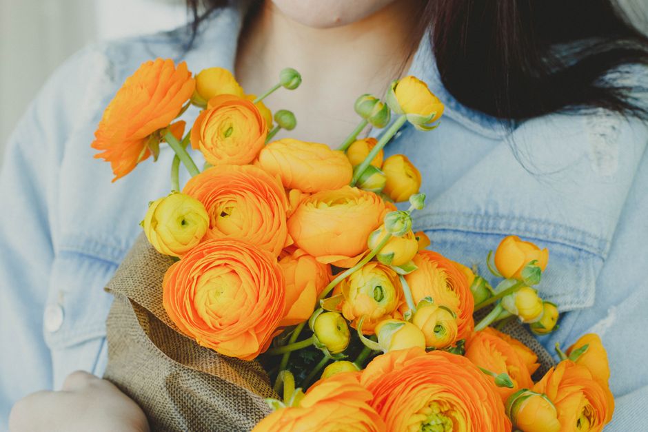
For most wardrobes, I would choose a bright accessory before a bright suit. It gives the biggest visual change with the smallest risk. Pastels are the better choice for soft tailoring and everyday layers; brights win when the outfit needs focus. Use the comparison below to make the final call.
Pick the formula that matches the occasion
| Goal | Color formula | Best clothing example | Verdict |
|---|---|---|---|
| Polished weekday outfit | Pastel plus navy | Powder-blue shirt and navy trousers | Best for quiet confidence |
| Easy weekend look | Bright accessory plus denim | Red bag, white tee, straight jeans | Best first step into brights |
| Statement event outfit | Two saturated colors | Purple jacket and tomato-red top | Best for high impact |
| Minimal wardrobe update | Soft white plus one accent | Cloud Dancer base and green shoes | Best for repeat wear |
Spend on the piece you will repeat
A Zara Satin Effect Skirt, often listed around $49.90, can make a pastel top feel evening-ready, but satin needs careful washing and shows creasing. Buy it only if you already own shoes and knitwear that support it. If you want one reliable spring purchase, choose a washable shirt, cardigan, or shoe instead. Color should make dressing easier, not create a closet full of one-outfit experiments. Pastels offer calm polish; brights offer immediate energy. Both work when the silhouette stays clear and the color has a defined job.